
Bay Alarm Medical
Bay Alarm Medical is an established Medical Device firm that needs a digital tool to enhance their existing product.
The challenge: Users rely on BAM's equipment and services as they currently exist-- but would like further assurance that the device works as expected, and more information in an emergency. Our challenge was to design a digital solution for medical device users that complemented the utility of BAM’s existing system— with no disruption to that system.

Deliverable: A mobile app designed for the loved ones of Medical Device users that compliments the utility of BAM’s existing system.
Time: 2 weeks
Team: 4 General Assembly Students
Role: research, survey design, interviews, prototyping
Tools: Pen and Paper, Sketch, Invision

Illustration: Sarah Glanville
"These systems have remained essentially unchanged for thirty years."—Dispatcher interview
Preliminary research: Why are medical alerts so popular, and seemingly stagnant in their design?:
We knew that before we knew what to design, we needed to do some research to understand how the devices worked. We discovered from numerous phone interviews with Bay Alarm and its direct competitors that the Emergency Response Equipment and Flow was pretty standardized across the industry. Now, we needed to know who the users and purchasers of medical devices were. What were their needs? How well did the existing design serve those needs?

Illustration: Sarah Glanville
Secondary data: a complex ecosystem drives the purchase and use of Medical alerts
During our literature review, my team discussed the opportunity of a well-designed medical alert tool to serve all populations with chronic health conditions. However, our client brief was clear that changes to the system design should not interrupt the utility of the current system for its existing end users. Available customer data indicated that the end-users of the present device were overwhelmingly elderly. However, this data also told us that the devices were not being purchased by elderly end-users, but primarily by their adult children. Since these purchasers were generally also the point of contact in an emergency scenario, we were not dealing with a single end-user but with a complex service design ecosystem in which multiple participants had a profound emotional investment, were making purchasing decisions, and were participants in the emergency response service. With this broadened criteria for "user," we developed a screener and survey with which to interview current and potential users of medical alerts.
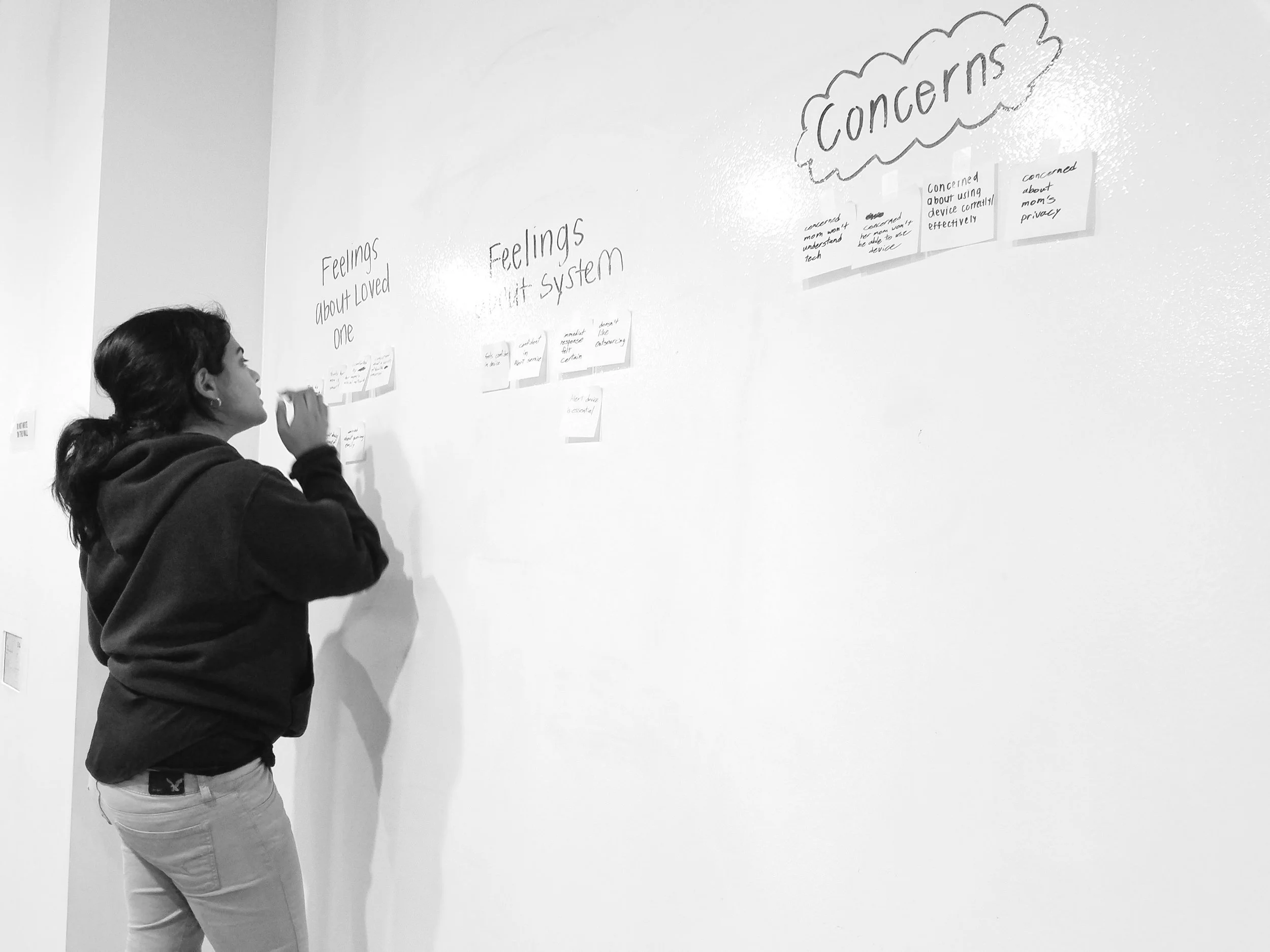
Photo: Sarah Glanville
Interviews And affinity mapping: a story emerges
We conducted 17 interviews and created an affinity map using quotes that met our criteria as emotionally charged or incredibly insightful. We divided our map into two sections-- excerpts from the “emergent health crisis" group, & quotes from their loved ones. We began to find over-arching themes among the loved ones of end-users. They conveyed a lot of feeling and detail when asked to recall or imagine an event in which a loved one experienced an emergency.
Illustration: Sarah Glanville
Personas: Stories inform the design
Our affinity-grouped quotes led us to explore some user journeys around emergencies. At this point, we theorized that in this short sprint, we could create the most value by solving problems primarily for the '“loved ones”— the end-users purchasing the device and serving as the point of contact in an emergency. We combined these thematic concerns into our primary persona, "Carlos." At this point, we had an epiphany about our product. Essentially, our product was reassurance. This was what the children of the elderly end-users wanted to purchase and why they were buying the existing systems. They wanted to know their loved one was okay, and they wanted something that could lighten the burden of their own worry. Perhaps most importantly, users feared that change could break the existing system. This insight explained why an imperfect product that had not seen innovation in 30 years had grown its user base in the age of smart home technology.
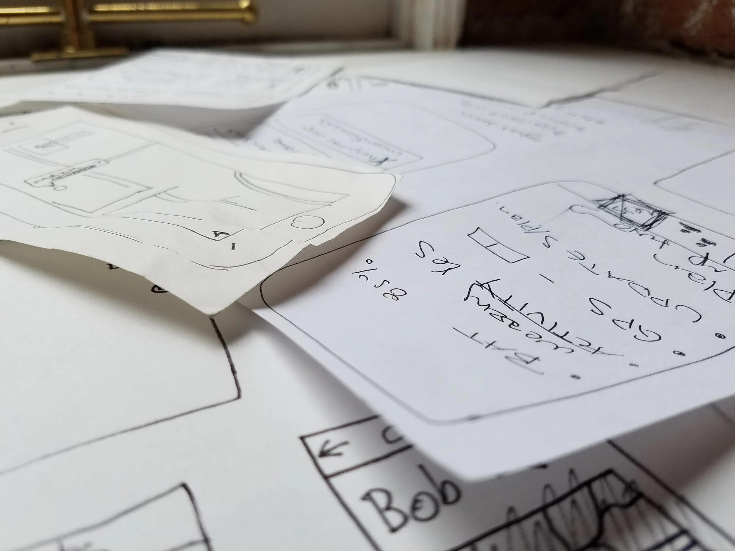
Photo: Sarah Glanville
iterating for design: prototyping reassurance
We would create “Reassurance” for Carlos, a busy family man worried about his elderly aunt Pat. We created and tested three different versions of a paper prototype. These prototypes contained some good ideas, and we all came back together excited about the features we had included in our designs. Our hypothetical solution was a multi-featured app and a companion wearable that would tell anxious family members everything they could want to know about their loved ones. Features included an in-app text and geolocation feature, so the first point of contact, Carlos, could find and contact a nearby family member to check on “Pat.” This feature tested well, and we were excited. Two prototypes included biometric data features.
user flows: too much information is not reassurance
When our team came back together, we started whiteboarding to examine different user flows for our persona, Carlos. We explored scenarios where our features could break the existing system and fail to reassure Carlos. These were of particular concern for the emergency flow. How would we prevent disruptive cross-communication in an emergency?
How would we prevent disruptive cross-communication in an emergency?
Did Pat’s nephew, Carlos, really want to know how her blood pressure dropped off right before her fall?
Was it fair to present Carlos with a map view of Pat’s ambulance heading in a direction that contradicted his assumption that she should be delivered to the closest hospital?
Would placing the burden to respond on a neighbor leave too much room for contingency?
How would we solve for concerned loved ones who had only SMS capability on their devices or who had landlines only?

Photo: Sarah Glanville
paper prototypes: better flow, fewer features
We created three paper prototypes to gather tester insights, particularly around determining the appropriate amount of information to share with '“loved ones” and questions about a system that would not assume universal smartphone access. Seven individuals tested each prototype. Some key themes emerged:
"Is this 'chose your adventure' for sociopaths? When would anyone look at vitals in an emergency? I would be driving." —Stephanie
“For much of my family in the South, cell phones are still a luxury.”— Lenore
"Nothing will alleviate the anxiety about what's happening in an emergency--but your involvement can be mitigated."— Alice
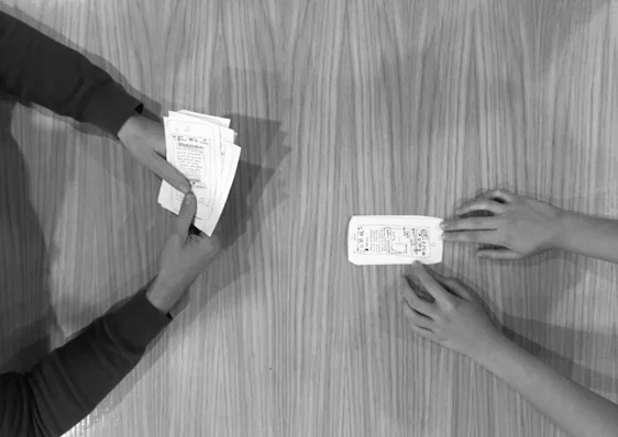
Photo: Sarah Glanville
feature Prioritization: Don't break it
Based on tester insights, we decided that messaging would have to be directed out of app to SMS and not developed as an integrated part of the app. We knew that our primary persona, Carlos, needed enough information about his aunt to help him feel reassured with credible and actionable information, but nothing that would cause further feelings of helplessness or confusion. Carlos needed to know information about Pat’s hospital WHEN she got there, not the ability to watch a GPS-tracked ambulance hurtling through the night. He wanted to know that her device was charged and working, not that her blood pressure was dropping. He wanted to know his relatives were informed, not to include and exclude them based on their available technology. With this information, we created our first wireframes and tested them. Testing the wireframe prototypes encouraged us to edit further, and create the final prototype iteration for this sprint.
Sprint one: a simple design solution grounded in user Needs benefits the design of future iterations.
In sprint one, we made the decision to iterate for the most likely user flows in an emergency and non-emergency as well as an enhancement of BAM's current system. By making some design decisions around restraint, we were able to align our features with our users' needs. We created a solid digital design solution to enhance BAM’s system, and produce greater reassurance for people like "Carlos."
Design features:
hard modal emergency alerts -- no preemption of existing phone-alert system
out of app SMS messaging
GPS tracking of the device that could be opted in or out of in non-emergency, but always activated in an emergency
Hospital contact info only after confirmed ambulance arrival at hospital--no speculation
biometric data limited
fall detection
battery charge readings
device "being worn" confirmation

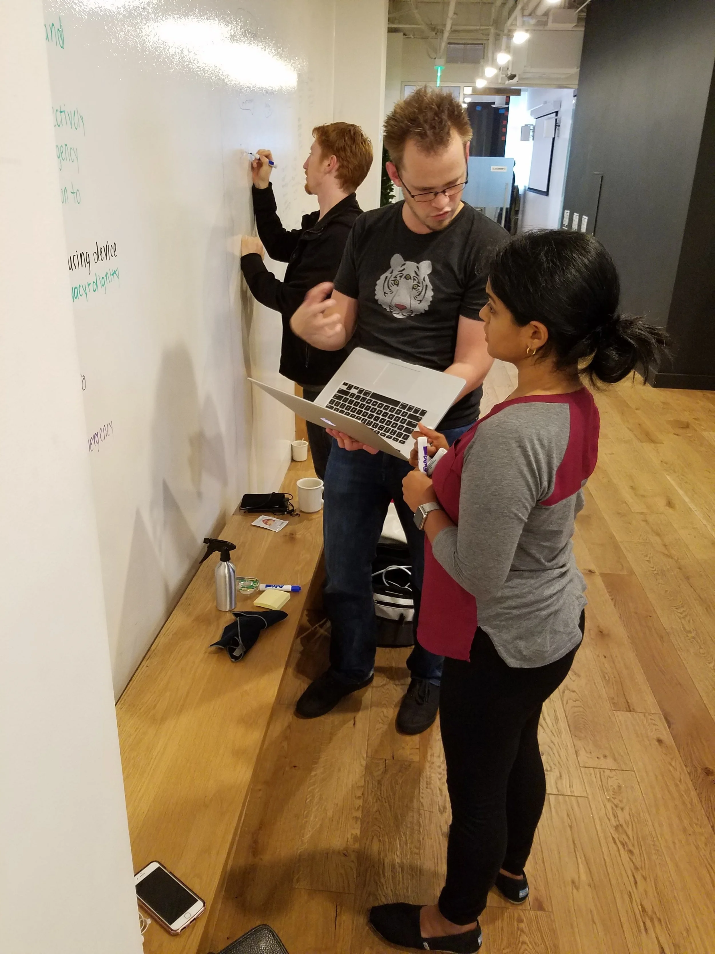
Photo: Sarah Glanville
...what's next?
Moving forward, I would like to explore developing the design to include features that might serve those like "Pat," our elderly end-user persona better. In our short sprint, it was a good design decision to start with the simplest and most powerful solution first; but we all wanted to make something better for the original end-user. Two of the end-user interviewees mentioned disliking the current wearable device design, stating that they were ugly and stigmatizing. Another interviewee mentioned the lack of two-way communication through the wearables, and that the system relied on the user speaking loud enough to be "heard" by a unit that was potentially far away in another room. There is a clear opportunity to further expand both the wearable and app end of the product line, and use-cases are potentially much broader than designed for currently. Further research could help discover how to improve overall design without disrupting the existing system.